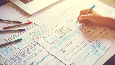
If you are a new blogger you might want to choose a blog layout based on looks alone, but we warn against that. You need to take some important layout and design considerations into account first.
Mai Theme is a great choice as your foundation, not only because it’s a WordPress theme, but because it offers so many personalization options with layouts, page templates, grids, sections, columns, header options, menus, widgets, and archive settings, to make your blog look truly unique but still prioritizes the user experience.
Read the Transcript
In this topic, we’re going to focus on some design and layout considerations. We want you to think about your menu layout, we want you to think about whether or not you want a sidebar. You know, a few years ago everybody used the sidebar because it was … a great way to put links and things on the side, but today with mobile responsive design, if somebody’s on the cell phone or tablet and those sidebars tend to drop to the bottom. So if you think primary content, primary important information in a sidebar on mobile, it’s going to be all the way at the bottom of your post. So we’re going to talk about those design considerations. We’re going to talk about using medium width content and I think there are some really important things that you can do to make your design simple and easy to use. As you’re creating your content and your design think about where that call to action should be, where do you want that lead generation request to be, and go through this lesson, follow some of the tips and tricks, and the way Mai Solution is built, you can use the customizer to see some of the changes and some of the visual opportunities that are there to style your website different than everybody else’s.
So check it out. Let’s go through this topic and look at how to build your website with certain design considerations.
Key Design Principles
Use these three key design principles for a great blog design and layout.
- Make it simple: A clean, simple look helps visitors find what they need without distractions.
- Make it consistent: You color scheme, typography, font size, writing voice, types of images you use, and how you structure your posts should be consistent (e.g. use of featured images or banners, including a summary and recap paragraph, etc).
- Make it actionable: Your copy, design, and CTAs should drive the visitor to take action. Be clear and concise in your language.
Navigation
Clear navigation can make or break your blog. If your visitors cannot quickly and easily find what they need, they won’t stick around for long. There are a few navigation basics you should make sure to implement on your site. These include:
- breadcrumbs
- post name permalink structure (how to set up will be in the next lesson of this course)
- clearly laid out menus that emphasize the most important content
- search bar at the top of the site
- internal links (and external links, but more so to build cred)
- related content links at the end of posts (*important* it should be specifically related)

Menus
Your menus are where your most important content goes. A new visitor to your site should be able to look at your menus and have a pretty clear idea of what you do and where to look for the information they need. Most of your menus are anchored to the top of the page on all pages (except in the case of landing pages where there is no viewable menu).
Certain menu items are typically associated with common locations, and thus make it easier for visitors to find what they need.
Primary Menu: The most important pages on your site. Blog category archive pages are a great on most bloggers’ main menus. (Make sure to put some content on your archive pages. They have the potential to rank really well in Google if you do.)
Header Menus: Mai Theme has built-in header left and head right menus. Which of these you use will be based on your content, where you want it, and also whether or not you decide to center your logo. Items that could go on this menu include Start Here, Products, Services, About, Work with Me/Us, Courses, Shop, etc.
Utility Menu: This menu typically appears in the upper right corner of your blog. Common links in the utility menu are Contact Us, Blog, My Account/Login, Affiliate Area, Cart.
Footer Menu: This is where the privacy policy and terms and conditions should go. It’s also a good place for social media links and Contact Us (or contact info). Some people even place a contact form here, but it is not required.
Mobile Menu: Don’t do anything, and Mai Theme will use any visible menu in the mobile menu automatically. Since Google has recently adopted mobile-first indexing, it’s important to note that all your site content between desktop and mobile needs to match.
Sidebar
As mentioned in the video above, you should think carefully about whether or not you want to use a sidebar on your blog. Don’t just use one because you always have.
They can be useful if you plan to use display ads to monetize your blog, but oftentimes they are not needed and can actually be a distraction if you’ve got too much going on in that area.
If do decide on sidebar layout, Mai Theme offers five built-in sidebar layouts to choose from so you can have a right sidebar, left sidebar, or even two sidebars.
Sidebar layout options:
- Content/Sidebar
- Sidebar/Content
- Sidebar/Content/Sidebar
- Content/Sidebar/Sidebar
- Sidebar/Sidebar/Content
Medium Width Layout
You’ve probably noticed a lot of your favorite blogs use the medium width layout. The medium width layout is so popular with many bloggers because it looks clean, modern, and makes your content the star.
We use the medium width layout on our own site and highly recommend it to our clients because it lets readers focus on the content without distractions. Full-width has a similar effect, but medium width is a bit better for readability since it adds some white space and your eye doesn’t need to scan as far across the page.
In the end, you’ll choose the page layout that best fits your needs, but keep in mind, the more distractions you have, the greater the chance people may navigate away from your site. Mai Theme offers 9 page/post layouts to choose from, so you can always switch out your layout to test another design and see if works better for you and your audience.
Accessible Web Design
Accessible web design refers to design principles that specifically take the needs of people with disabilities into account. It’s important that all users can access and use your site, regardless of disability, so that you are not excluding anyone.
If you are just starting out with a new blog, you might think you don’t need to worry about this right away, but it’s definitely better to start implementing accessibility now rather than later.
In many situations, web accessibility is required by law, so it’s important to do some research on how these standards are enforced in your country. Visit the World Wide Web Consortium’s (W3C) website to learn more about W3C Accessibility Standards.

Core Pages
We already talked about your core pages and the importance of this content in our Content Considerations topic, but it’s worth reiterating that these pages are key to your website design and layout as well.
Create and layout these core pages on your menu so that users can easily find out more about who you are, what you write about, what products or services you offer, and how to contact you.
Pages you definitely want to have:
- Homepage
- Blog page
- Start Here
- Contact
- About
- Terms and Conditions/Terms of Use
Other important pages you may want to have:
- Affiliate Program/sign up
- Products or services pages and archive
- Other important archive pages (blog category archives, product category archives)
- Landing pages (You may not want these on your main menu, but they can be really useful for marketing campaigns.)
