“Why is my banner zoomed in?”
“Why is my head chopped off!?”
“Why are my images blurry?”
We get asked these questions all the time. So much, we realized we needed to give a detailed explanation of the importance of website image aspect ratios. We know it can be confusing, so with our explanations, analogies, and animations, our goal is to give you a better understanding of both web images and getting your site looking remarkable.
Let’s start with the basics.

Get personalized content recommendations and answers drawn from our website. Simply type your question or topic of interest, and our AI assistant will help you find relevant articles, tips, and insights. You can also have a natural conversation to explore topics in more depth.
Gain a Basic Understanding of Images
Images are oriented into one of two formats: portrait or landscape.
Imagine a photographer taking a picture of the sunrise with lakes and mountains spanning across the horizon. The photographer needs to capture the grand majesty of that mountain-scape. So the shot is taken as wide as possible to get those exaggerated perspectives. In other words, the photo will be wider than it is tall and works perfectly for a widescreen format.

The same can apply to digital video. If you saw Avatar during its theatrical release (or even on your widescreen tv), you may notice it’s shot in a widescreen format. In fact, Avatar is considered one of the best films shot in IMAX—using high-resolution film cameras and very large screens. This helps create a more immersive, high definition experience for the viewer, which is pretty important when a film is predicated upon a larger than life fantasy world. In other words, orientation matters.
Alternatively, a portrait format creates an image that is taller than it is wide. Think of the way traditional portraits depict a person from head to shoulders and captures them looking directly at the artist.

Once you’ve determined the orientation, it’s time to think about the size.
Why Does Image Size Matter for the Web?
Image size determines how large the image displays on your site. Ask yourself: How important is this image? How much impact do I want this image to make? Naturally, the more important the image, the bigger it should be.
Optimize Images and Page Speed
You need to find the right balance between size and quality. Low-quality images look blurry, but large images slow down your website. There are times when using a larger format image is justified, like banner images. Slow load times are not only annoying, but also negatively affect SEO. Consider the following best practices to appropriately upload images.
What Size Image Should You Upload?
- Consider file size: File size can dramatically slow down your website. Find out how many bytes the file size contains. An image file size in MB (megabytes) is huge, while an image in KB (kilobytes) is much more web-friendly. If your file size is really large, compress your images with ImageOptim.
- Determine image size: Decide how much space should be taken up by the image. A thumbnail image displayed at 150px wide should not be uploaded at 1000px. For fullscreen images, like banners, a 2000px wide image is generally successful. If you plan to upload huge images (3000px or more), you may want to consider using a plugin like Imsanity to control extra-large images with a max size. Modern WordPress themes are typically designed to leverage multiple images sizes and register those image sizes in WordPress to allow uploaded images to have multiple automatically generated image sizes.
- Resolution for web images: The higher resolution, the larger file size it will be. Web images are measured in pixels and should use a standard screen resolution of 72 PPI (pixels per inch). Resolution is another word used to describe the measurement of pixels. Keep in mind that the resolution of the original image affects how it displays. If you have the option in your image editor (e.g. Photoshop), always “Save for web;” this gives your image a web-friendly resolution.
Choosing Inline vs. Background Images
If your image is significant, display it as an inline image, rather than a background image. An inline image is set within the body of a page, where you can manually adjust its size and alignment.
Background images are just that—backgrounds; they lay behind some text to break up white space and give your site some texture, but they’re not meant to be the focus. We recommend using simple images for background images so any overlaying text is easy to read. If you must have a subject or faces in your website background image, make sure the focal point is near the center to prevent heads from getting “chopped off” or having text overlay a face.
We Love These Image Sizes for the Web
You need to research how your WordPress theme uses images. Mai Theme defines a handful of custom image sizes so you don’t have to worry.
All of these Mai Theme registered image sizes have predefined sizes and fixed aspect ratios. Using any of these sizes will show a cropped portion of the full image at the set width/height.
- Width 1600px / height 533px = aspect ratio 3:1. This size is perfect for displaying a fullscreen hero image at the top of your site. Mai Theme utilizes this size for Small and Medium height banners. (Check out these tutorials for setting up your website header and page headers in Mai Theme 2.0.)
- Width 1600px / height 900px = aspect ratio 16:9. This size works best as a fullscreen image. It’s still considered landscape format, but uses the majority of a standard laptop screen. Mai Theme utilizes this size for Large and Extra Large height sections.
- Width 800px / height: 600px = aspect ratio 4:3. In digital photography, this the most common aspect ratio. This size uses a little less than two-thirds of your screen.
- Width 550px / height 413px = aspect ratio 4:3. This ratio is really close to what most cameras shoot images at and takes up about half your screen. This size is perfect for two-column blog archives.
- Width 350px / height 263px = aspect ratio 4:3. Most stock images utilize this ratio. It’s about one-third of your screen, so it’s great for a three-column archive.
- Width 260px / height 195px = aspect ratio 4:3. This ratio takes up about one-fourth your screen—perfect for four-columns.
If you’d like to change the registered image sizes with a plugin, Simple Image Sizes is super easy to use. If you prefer code, follow the instructions in our support doc.
Explore Image Shape (AKA Aspect Ratio)
All images have a proportional relationship between width and height (x:y), this determines the shape—also known as the aspect ratio. The most common aspect ratio of digital cameras and mobile devices is 4:3—which qualifies as a landscape format and is generally deemed as more successful than portrait format on websites.
All three of these images below vary in size, but have the same aspect ratio of 3:2. Simply put, for every 3 parts of the width, there are an equal 2 parts that make up the height.
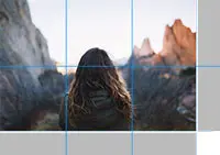
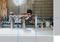
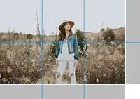
To make an image wider or taller, use crop tools or media editors to entirely change its shape. By changing it’s shape, you change the aspect ratio. To get a good understanding of what ratios you’re working with, plug your image dimensions in an aspect ratio calculator.
The Dollar Bill Analogy
A traditional US dollar bill has an aspect ratio of approximately 7:3. The image below is displayed at 700px wide by 300px tall, unaltered in any shape or form.

For sake of argument, go ahead and take out a dollar. You cannot stretch or modify the bill’s shape—only the size may be perceived as bigger or smaller depending on how close it is to your eyes.
Imagine if the height of $1 was set to a fixed 3:1 ratio, like in our next example. You can clearly see that the $1 is not wide enough to fill the container. The black bars indicate where your image is missing.

How Will the $1 Bill Look on a Real Website?
First, you will never see the black bars from these examples on a real website. Instead, the $1 will increase in size to fill the entire container—keeping the preconfigured aspect ratio. This is where images are sometimes interpreted as “zoomed in.”
When an image is forced into a fixed background size, it’s taken from the center and expands out. So how will the $1 fit in our Mai Theme registered sizes? Notice the black bars cutting off the edges of the $1 in order to fill the size.


Not every image is going to be the right for every size, but sometimes you can crop images to change the original aspect ratio and make the picture work without compromising the subject.
Responsive Design
Responsive website templates are so important for the web nowadays. Make sure your theme adapts sizes on a variety of devices, screens, and computer monitor sizes. That could mean images become temperamental on responsive web designs. People love using faces as their hero image, but too often, the site immediately chops off the top of their head.
Incorporate Stylistic Overlays
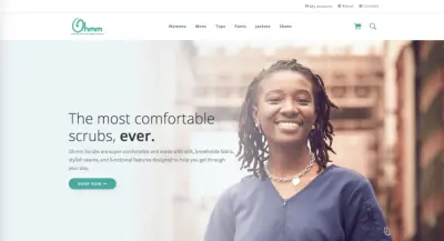
Here on Ohmm Scrubs, we use a big background image with some text. The white text is quickly lost in the photo.

By incorporating a CSS gradient overlay, we ensure legible text and a great user experience on desktop. You should style your overlay based on your website design. Use your brand colors to make it your own.
Since our text floats on the left side, while the woman sits on the right, a left-to-right gradient was appropriate. The left side of the gradient acts as a backdrop for the text using an off-white background color. The right side of the gradient fades into a transparent background so the woman’s face is visible. If you’re not comfortable with CSS code, you can modify images in Photoshop to get the desired effect.
What about mobile? The image shape changes entirely, so plan your gradient overlay accordingly. If we use the same gradient on mobile, here’s what it looks like.

The text is quickly lost, again!
Here’s the fix: media queries. Add a max-width to the overlay to cover a larger portion of the image on small screens to ensure it looks good on all devices.

Properly Utilize Text on Images
Full frame images on desktop have a much longer side than that on mobile—and turns into much more of a square format. Notice that not only does the image’s width tighten up, but the text starts wrapping more due to the thinned screen size, and ultimately causes the height of the image to increase.
Even a sentence or two can dramatically alter the height of the image on mobile apps. The thinner the device, the more it collapses into a square image, or even a portrait format. We recommend keeping your overlay text short and sweet.
On Ohmm, notice how desktop has six lines of text, while the iPhone 6/7/8 has eight. It will change on every screen size.
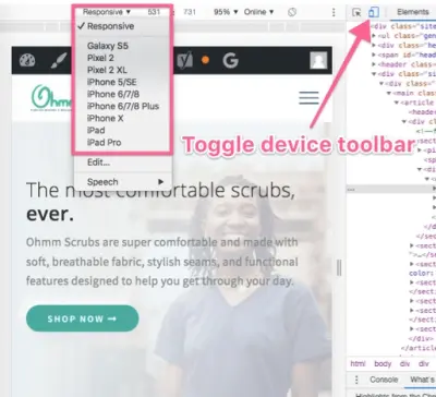
How can you see what an image looks like on all devices? Easy. The Inspector Element tool.
Inspect Your Design Before Publishing
Each screen size has a different aspect ratio. Mai Theme is responsive, so your background images are intended to change shape based on the mobile device.
Check on an Apple iPhone X, Samsung Galaxy s8, tablet, and desktop to see how your image areas change display. This is why we stress using more ambiguous background images that suit all screen sizes.
Want to preview how a site design would look on mobile? Right-click on any webpage, click Inspect, and resize the browser to see how things look on any device. Select the toggle device toolbar, then use the dropdown menu to select any smartphone device.
Think About Where Your Images Will Display
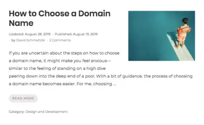
Consider everywhere your images will display. On BizBudding, we use a full-width banner at the top of our blog posts. The aspect ratio for those images is about 3:1. On our blog archive, we use a smaller image size at about a 4:3 ratio. Both of those sizes need to be taken into consideration when choosing the article’s featured image. They need to work for both sizes and ratios. Here’s where we went wrong.
In this article, How to Choose a Domain Name, we wanted an image of a boy on a diving board to depict the anxiety when picking a domain name (or when you’re on the high-dive). The original image was about 4:3, so it looked great on the blog archive…
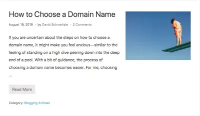
…but not so good on the banner.

Awkward.
Instead of trying to force it, we simply chose a similar image that would look good for both sizes—and still gets our message across. Even when the image gets cropped, it should be clear what’s going on. In this case, a downward angle to see the pool and more of the diving board was all we needed. Here’s what we could all agree on.

Why Certain Images Don’t Work
As mentioned before, an image that has a landscape orientation is often more successful.
You can easily figure that this image probably won’t work as a banner (3:1) image.

The dead giveaway is that it’s in portrait format. The shorter side of the image is at the top and bottom, rather than the sides. Since the image will be taken from the center and work it’s way out to fill the container, the focus is all wrong.
Need further proof? Here how it looks on desktop.
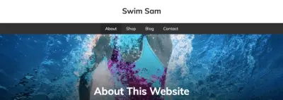
Yikes.
In this case, cropping and using plugins like Yo!mages or My Eyes Are Up Here may help, but knowing how to choose a successful banner image will surely save you some stress in the long-term.
Checklist for Choosing a Successful Background Image
- The focus is near the center
- It’s simple enough to have readable overlay text
- The image uses a landscape format
- Bonus points: the subject itself is horizontal
Based on that criteria, here’s the image we’ve selected.

Let’s see it in action.
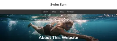
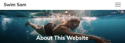

That’s a pretty successful background banner image across all devices.
Image Aspect Ratios Takeaways
- Not every image is going to be the right shape for your requirements.
- Sometimes you’ll be able to change the aspect ratio of an image to make it work for the size and shape without compromising the subject—other times you just can’t.
- Consider if your image can be altered to fit the size and aspect ratio.
- Background images are not supposed to be the focus. If it’s important, add it as an inline image.
- For background images, choose simple images so that any overlaying text is easy to read.
- Remember that all of your background images will change shape for different screen sizes.
Images can greatly impact your website’s design, but not every image is going to work in every area. We know it can be confusing, but we hope our examples have given you a better understanding of both web images and how to make your site look remarkable. Feel free to drop us a comment if we can clear anything else up for you.
Download the How to Start Blogging Guide
Explore this FREE GUIDE to take a deep dive into how to start blogging to make money. Get a PDF version of this guide right to your email, plus weekly tips from our blogging experts at BizBudding.


