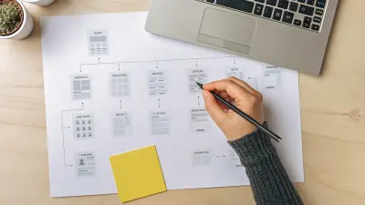
The website header is the first thing your visitors see when they click on a website. It serves as a first impression and indicator of the site’s quality. This makes the header one of the most important parts of your site’s design elements, so it needs to look as nice as possible. This doesn’t just include style (although that is important); it’s also about functionality and UX design. Keep reading to learn everything you need to know about how to design the perfect header that is clear, visually appealing, and user friendly.
This post contains many examples, videos, and tutorials to help you visualize and understand how to set up and customize your page and website headers in Mai Theme 2.0.

Get personalized content recommendations and answers drawn from our website. Simply type your question or topic of interest, and our AI assistant will help you find relevant articles, tips, and insights. You can also have a natural conversation to explore topics in more depth.
What Makes Up a Website Header?
The website header is located at the very top of a web page. More specifically, the page header is considered to be the space above the fold of the homepage (the part of a web page that is visible before scrolling).
Since the header section of a website is the first thing that grabs your visitors’ attention, it needs to have a good representation of what the site/brand/business is all about. It should be clear, organized, and easy to navigate.
Some sites have separate headers for different pages. For example, they have a larger header on the home page, but smaller headers (fewer elements) for the rest of their pages. You can do this too, but just keep the look of it consistent. The best design practice, in this case, is to have abbreviated versions of the main page header on your other pages.
A webpage header should have the following elements:
- Logo
- Headline / tagline
- Call to action button and text (Mai Theme Pro and Lifetime Bundle owners can get CTA patterns here.)
- Navigational elements (menus)
- Search
- Shopping cart (if you have an ecommerce site)
- Contact link or phone number (if you have a business site)
- Login (if your site involves membership)
Stick to the basic elements of what to include when designing a header. You don’t want it overstuffed or visitors will get overwhelmed or confused and leave. It will also create confusion if your header is so empty that users can’t figure out what your site is about or where the content is.
Minimal Website Headers
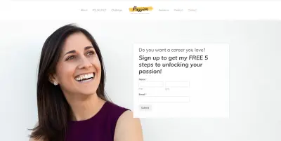
Minimalism is on the rise! And it doesn’t just apply to living with less—it’s also is a website design trend. If you want a minimal design for your header, that’s perfectly fine as long as it’s clear what your site’s about! A minimalistic header only includes a logo and a menu with links to the most important pages (usually 4-6 page links). Read our post on the benefits of minimal website design to learn more.
Here are some examples of minimal headers from our Mai Theme clients:



Next, let’s go over all the elements of a website header, best practices in header design, and set up instructions so you know how they all work together to help you build your audience/customer base.
Logo
Your company logo is the most important part of your brand identity, so naturally, you want to draw attention to it. You may be thinking that if the logo is so important, then why not place it in the center or on the right to be different?
There’s no standard practice on where to place your logo, but the most common placement within the website header is on the left corner.
According to a Nielsen Norman Group study users are 89% more likely to remember a logo placed at the top left rather than at the top right.
While centered logos don’t affect brand memorability quite as much, they do impact navigation/usability. In the same NNG study, users were 6x more likely to be able to navigate to the homepage in a single click when the logo was on the left (compared to centered).
Centering a Logo
That’s some pretty good evidence for why you may want to opt for a traditional left-aligned logo. Still, a lot of our customers want to use a centered logo, and that is totally fine. We’re not advocating one way or another (however there seem to be no pros to right alignment, but if you want to throw caution to the wind, you can do it in Mai Theme 2.0).
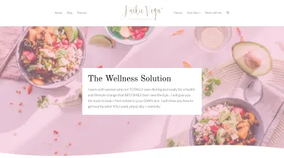
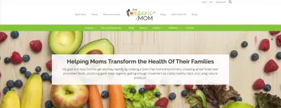
We’ve seen health and wellness sites in particular adopting the centered logo a lot, but that by no means you must do the same if you are also in this industry.
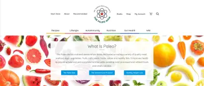
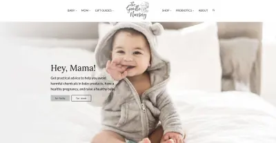
A centered logo looks best when there is an equal number of menu items on each side of it (not counting search/cart icons) and the menu that shares space with the logo is relatively minimal.
Centered Logo Examples
Some sites even use a layout with the logo above the menu completely. Here’s an example from a brand everyone knows—Coca-Cola.
Here are some examples of bloggers and health practitioners using a centered logo (all are Mai Theme users).

Considerations Before Choosing a Centered Logo
Before you decide to center your logo, you should consider the following characteristics:
- its shape – round logos tend to look great centered
- its size – if the logo is on the small side it may get lost in the center or may not be clear that it is, in fact, a logo
- if it’s stacked or horizontal – logos that are more on the square side or that have a greater height tend to look good centered because the text around them balances them out
- logo elements – if the logo is words only, image only, or an image with words
- your industry – if your business is more conservative or traditional, you cannot go wrong with the classic left-aligned logo
You should also think about the spacing around the logo and how to break up your menu items (what goes on the right, left, and how your menu items are grouped) to achieve the most balanced look.
How to Center Your Logo in Mai Theme 2.0
This all might sound complicated, but in Mai Theme 2.0, we make it really easy for you to control and customize ALL of this.
Visualize and change your logo placement in real-time using the Customizer. (What you are actually adjusting are your menu locations.)
Watch this video to see how easy it is to center your logo.
We do recommend you picking a placement for your logo and not changing it around too much, if ever—unless you decide on a new brand design/refresh. Familiarity and consistency are important when it comes to brand recognition; you don’t want to destabilize your website visitors with frequent, big changes to your page header.
Call-to-Action
The text of your header should include a headline or tagline. This text should encompass your brand and the purpose of your site/business/blog.
A call to action (CTA) is commonly used in a header’s text as well, accompanied by a button. Whatever text you include should be short, grab a user’s attention, and, as the name implies, inspire them to act.
Mai Theme Pro and Lifetime Bundle owners can utilize the CTA patterns in the Mai Pattern Library.
What should my CTA be?
While your first instinct may be to encourage your visitors to “Buy Now,” that’s not really how the customer journey works. (Of course, there are some exceptions, depending on your business.)
Here are some recommendations for your website header CTA:
- invite people to learn more about a topic (link to a popular post, evergreen content, or Start Here page)
- ask them to call or contact you for a consult, quote, or more information (include form or link to a contact page)
- tell them where they can start (link to a Start Here page)
- offer a lead magnet (include a form or link to another page where they can get it)
- direct them to more info about your product or services
- ask them to sign up for email updates, alerts, special offers, insider info, etc.
You can also include a temporary CTA that you can replace or remove when necessary to promote your latest products, services, or content.
Typography
The typography you use for your header text should be simple and easy to read. This includes the text you use for page links in your menu (more on the menu later) and even your colors for that matter. Don’t use any fancy fonts. They may look pretty, but they can often be hard to read, and it’s not worth confusing or inconveniencing your visitors.
In Mai Theme 2.0, easily set your body and heading typography with loads of Google font options. Here’s how to customize your site’s typography.
Images
A really creative website header would feature a visually striking header image. Blog posts have feature images at the top because a visual element is more eye-catching than text alone.
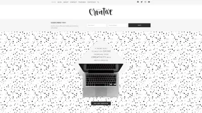
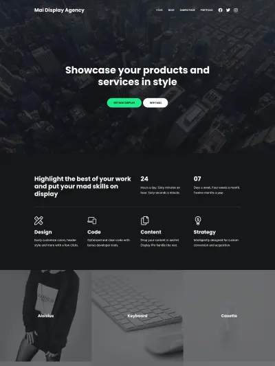
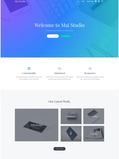
For even more impact, you could use an extra large image on your homepage header. This style works best for creative niches—like design agencies or artists—or if you have gorgeous photos you want to showcase—photography, wedding, real estate, or portfolio sites.
Mai Themes with large header images:
But hold on! While you can definitely pick your Mai Theme based on its design, it’s also possible to create the large header you want with any Mai Theme (v2). That’s because the functionality is built right in.
When you purchase the Mai Theme, you get every one of our website templates and starter sites so you can pick and choose your favorite features and combine them to create a unique site you truly love.
When you set up your homepage cover block (the area where your hero image and CTA will live), all you need to do is adjust your spacing settings on the group block to make the image have a larger footprint. You can even throw an overlay on your image.
Here’s how to build a block-based homepage in Mai Theme 2.0 (focus on the beginning for header/cover block walk-through).
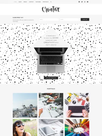
Instead of an image, you could opt for a solid background color in your header. A solid backgrounds or textual background images universally work well in page headers because there is nothing to get cut off. (Like in our aspect ratio post where our designer Sam loses her head.)
Do you like the overall design of one Mai Theme website template but the homepage from another template?
When you purchase the Mai Theme Pro Bundle and with Mai Theme, not only do you save $50, but you get access to the Mai Pattern Library which contains the homepage patterns from all of our website templates. Copy the one you like and paste it into your current template. It’s that easy!
Page Headers (Single Page/Post)
As mentioned previously, your homepage will have CTA text and a button, whereas most of your other page headers (should you choose to use them) could be more simple.
On our blog posts, we include page header text to give the visitor a summary of what the post is about so they can decide if they want to read more. We try to still word it like a CTA with actionable phrases like “Learn more about X” or “Read this post to understand Y.” This can be a good way to reduce bounce rate and increase time on page.
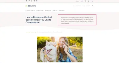
If you make this change and notice an increase in bounce rate/decrease in time on page this also tells you something. Likely it means that what people are finding when they reach the page is not matching up with their expectation or search query. You may need to tweak your content, optimize it for a more specific query, or update the post’s meta description.
How to Add a Page Header Description
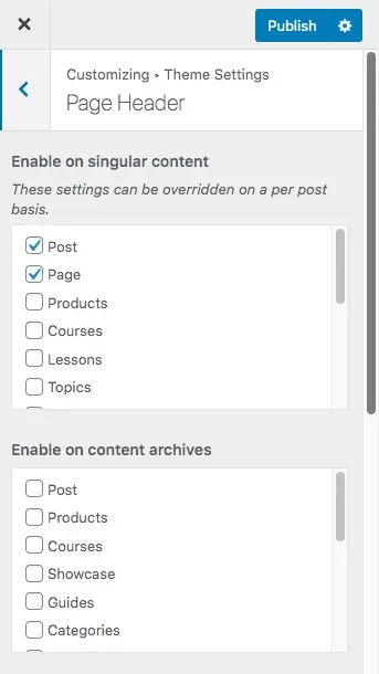
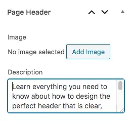
When editing the page or post, go to the Post tab in the sidebar. Scroll down until you see the Page Header meta box. Add your page header text in the Description field. You can also add a specific image here if you want. This will override any images you have set globally for pages or posts.
In order to display the page header description, make sure to enable the page header for pages and/or posts within the Customizer. See below video.
How to Add a Page Header in Mai Theme 2.0
Navigation & Menus
This is the other main feature of your header, besides your logo. Your site’s navigation element is designed by utilizing menus. The main menu is your site’s table of contents, and it should serve to point your visitors to the top pages (or parent pages) of where your content lives. You should have between 4-6 of these top page links in your header. Smaller sites can have less and larger sites can have a bit more, but you don’t want to go crazy or the header will look too busy and overwhelm your users.
Your menu should be horizontal since it makes the most visual sense. Most users are also used to that format. A horizontal menu also maximizes your page space and is easy to read.
How to Set Up Your Navigation Menus in Mai Theme 2.0
How to Display Child Pages (Subpages) in Mai Theme 2.0
We typically recommend against drop-downs on menus because they can make the design feel out-dated, and they present users with too many choices.
Instead, link to the parent page in your menu. Users will go there for more information, and when they reach that page you can present them with a grid of all child page options.
Displaying the child pages of any page is easy to do in Mai Theme 2.0. All you would do is insert a Mai Post Grid block where you want it on the page, then where it says “Get Entries By,” select “Parent” and identify the parent page.
The Parent settings is great for Services, Practice Areas, Our Team, etc. pages.
- Create a WordPress Page called “Services” (or whatever you want it to be) if you don’t already have one.
- Create a child page for each service by setting the “Services” page as the parent page via the Page Attributes metabox in the sidebar when creating/editing each page.
- Add a Mai Post Grid block to the Services page.
- Set “Get Entries By” to “Parent”.
- Check the box to “Show children of current entry”, or choose the “Services” page as the Parent page to display children of.
Here is an example of a grid of child pages for the parent Mai Theme page. View our Mai Post/Term Grid Block doc to learn more about what is possible with grids.
Search
A visible search bar in your header is a convenient feature that users will appreciate. It allows them to search for specific topics or products that they’re most interested in. The lack of a search feature in your menu is very inconvenient and even frustrating for visitors. It’s inevitable that you cannot fit everything important in your menus or users may have something very specific in mind they want to know. For this reason, having search in your header is a must.
Pressed for space, but still want to include search? Here’s how to add a search icon with a popup/dropdown search field to your menu in Mai Theme 2.0.
Contact
If you have a business website, then it’s a good idea to have your business’s telephone number in your header as well. The best practice is to not put your email and physical address in your header as well. Those generally located on a separate “Contact Us” page or in the footer.
This contact information should also not include social media links/icons. Those are best saved for your site’s footer too. This is because you want people to stay on your site for as long as possible. You could also put your social media icons in a floating sidebar, along with your email address. However, some users may find the floating sidebar irritating, so include at your own risk.
If your main goal is to get people to contact you, add your contact link as a menu button. It really makes it pop and people will be more likely to click. (You can use a callout button for whatever you want btw, not just Contact.)
Contact Form in Header
Earlier we mentioned that you may want to include a contact CTA with a form in your homepage header. This can be really powerful in increasing conversions, because it minimizes the steps someone needs to take to get in touch with you—no searching for contact information, no redirecting to a contact page, the form is just right there in the header. Magic.
Check out the below video about how to build a block-based homepage in Mai Theme 2.0 for more insight. While this video is not specifically about adding a contact form, Mike overviews cover blocks and group blocks in the beginning. You’ll want to add your form block (whether you are using WP Forms or something else) within this area. You can even set your form to overlap like he is showing here.
Shopping Cart
If you plan to sell products and/or services on your website, then you should have a shopping cart on the top right-hand side. This is so customers can add or see items in their cart easily. This makes it more convenient for them to buy products and for you to make more sales.
Add a cart icon for visual appeal or to save space on your menu. Here’s how to add menu icons in Mai Theme 2.0.
Login
If you have a site that involves membership or course, then you may want to include a login/account link in the header. Whether or not you include it depends on how important it is to you and your users and what other items are important to your menu.
Users should have a clear location of where to log in so that they can make the most of your website and services. The best placement for account login is at the top right-hand side in the utility menu or alternatively in the footer of your site if you already have a lot of other menu items and can afford to move the login/account link.
You can add an icon for your account login as mentioned above for the cart or simply link to it.
Sticky & Transparent Site Header
A good practice for desktop and mobile is to have a fixed header, also known as a sticky header. This is a current standard of web design because it makes for a more convenient user experience. A sticky header follows the screen as a user scrolls down, keeping important site elements within view so that they don’t have to keep scrolling back to the top.
A fixed header is especially useful for ecommerce websites and business sites because the cart, phone number, and CTA are always on display.
You can even enable a transparent header, and when sticky header is also enabled, the normal colors will reappear as you scroll. Watch this video to see how to enable those settings and what they look like in Mai Theme 2.0.
Mobile Design
Keep smaller screens in mind when you size and format the elements of your header.
The header should be correctly displayed not only on the desktop version of the website but also on the mobile one. It has to be responsive and able to adjust well to any mobile device. With Mai Theme 2.0 you don’t have to worry because all of this is accounted for and it is fully responsive and mobile-friendly.
When adjusting your the header size of pages and posts, pay attention the vertical spacing setting. You can use any value, but view port width (vw) is a great unit because it scales, so if you have a huge header, as you get down to mobile the header is not as huge—it’s relative to the width of device that you are on.
You can preview what header looks like on mobile by simply clicking the different device types at the bottom of the customizer. (This is available regardless of where you are in the Customizer.)
Here are the vertical spacing and mobile preview settings in the Customizer:
Mobile Menu
By default, the mobile menu in Mai Theme is automatically created from Header Left, Header Right, and After Header menus and will collapse those menu items into a hamburger menu (or hidden menu).
You can create a custom mobile menu, with additional content (search bar, social icons, etc) simply by adding widgets to the Mobile Menu widget area. View our doc on Customizing Your Mobile Menu to learn more.
Landing Pages
Your landing page header is going to look different from the header on the rest of your site. Landing page headers are typically a slimmed-down version of your regular page header. You may even want to remove your header elements altogether. It’s up to you and super simple in Mai Theme 2.0.
You don’t need a fancy landing page template, just build your page normally with blocks and then hide what you don’t want to show using the “Hide Elements” meta box. Remove menu/navigation links, footer, and more so what you are left with is just your logo and a banner/hero image (if desired).
However there are landing page patterns available in the Mai Theme Pro and Lifetime Bundle customers.
Here’s how to create a landing page with Mai Theme.
The Bottom Line
How visitors perceive your website (and your brand) is largely determined by your header. This means you should put careful thought into having a memorable and creative design, but once you are ready to customize your own website header, Mai Theme makes it easy. Keep this post on hand to be your guide on best practices and how to set things up.
Download the How to Start Blogging Guide
Explore this FREE GUIDE to take a deep dive into how to start blogging to make money. Get a PDF version of this guide right to your email, plus weekly tips from our blogging experts at BizBudding.


