If you are like most of our clients, when you are ready to build your website, your first instinct is to start with the homepage, but we believe that is actually the wrong approach. To build a successful homepage, without struggling to figure out what you will say or what sections of content it should include, you first need to build a few of your other core webpages, like your Work With Me or Services page.
This page is one of your key revenue drivers, so it is arguably even more important than you homepage. And unless the bulk of your traffic is from direct search and referrals, then the homepage is not even the first page your website visitors will see. If they are looking for help for a particular problem they are typically going to land on a blog post, product page, or services page.
This post will take you through the questions a services page should answer and what the page should look like (content and layout). I’ll also share some examples of my favorite client services pages and share a couple block-based page templates you can use to build your own services page.

Get personalized content recommendations and answers drawn from our website. Simply type your question or topic of interest, and our AI assistant will help you find relevant articles, tips, and insights. You can also have a natural conversation to explore topics in more depth.
6 Questions to Answer on Your Services Page
Potential customers visit the services page to find answers to six fundamental questions. Answering these questions not only helps establish that someone is in the right place and that your solution is for them, but it also helps weed out those who are not a fit or who are not ready to work with you yet.
1. Who
Question: Am I in the right place? Is this service is for me? Have others have had the success or outcome I would like to achieve?
How to Answer: Present the problem or desire. Reinforce that your solution has worked for others like them with testimonials, reviews, or case studies.
2. What
Questions: What is the solution, what does it look like, and can it solve my problem or deliver the outcome I desire?
How to Answer: Present your solution, features/functionality, details, benefits, and expected results. Paint a picture of what’s possible when someone chooses your solution.
3. Why
Question: How is your solution/service/package different/better than someone else’s?
How to Answer: Describe what makes your solution/services unique or different.
4. Where
Question: Where do you serve, where are you located, or where/how do we connect?
How to Answer: State the location you serve—whether this is a city, state, country, or another area of operation, the address of your business, or virtual + details of how you’ll connect/work together.
5. When
Question: When is the right time for me to act or get help? Or – When is your solution available? (For situations where the offer is time-based such as an event or course that runs a particular time of year)
How to Answer: Dig into why solving the problem or meeting the desire is crucial right now.
6. How
Question: How does this apply to me? How does it work?
How to Answer: People may still not be convinced your service is for them. Illustrate how your solution and services applies to your audience. Try to picture a unique individual—a customer persona—as you answer this. In addition, tell them how your service works to make sure you are a good fit to work together.
Some of the answers to these questions may run together, and that is perfectly okay! You simply want to address each one of these in some way.
Remember to always think about your target audience in your copywriting.
Next, let’s talk about what a services page should look like from a website design perspective.
What Should a Services Page Look Like?
Now that understand the questions you need to answer on your services page, how do you go about presenting your answers on the page? There is no single page layout that applies to all services or work with me pages, as the best layout for user experience varies based on your niche and services offered, but below are a few sections or elements you may want to include.
Your Services
To state the obvious, you need to show people the type of services you offer (if more than one) and information about each one.
You can link off to individual landing pages that gives more detail about each one or include sections right on your services page. The former may be a better option if you have long-form, high-quality content for each service and you want to optimize those keywords for SEO. In this case, use the Mai Term Grid block to show all of your services in a easy to view grid.
Features / Benefits
You can showcase your service’s features, benefits, and more in a variety of ways using blocks. Here are just a few options we like:
- Columns block or Mai Columns block (exclusive to Mai Theme)
- List block (simple bullet points)
- Mai List block (icon list, exclusive to Mai Theme)
- Cover block
- Video embed
Check out our Features block patterns in the Mai Pattern Library for inspiration.
Here is one we think you might like:
Client Testimonials
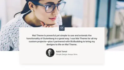
People feel more confident about taking action after reading a couple of glowing testimonials. Customer and client testimonials are a great way to show social proof and build trust with your audience.
Check out our Testimonial block patterns in the Mai Pattern Library for inspiration. Here is one we think you might like:
FAQ
One tried and true way to answer your audience’s questions is by using an FAQ. Build an expandable/collapsable FAQ quickly and easily using the Mai Accordion plugin. Simply add a title/question, then easily insert your answer in the content area. You can even set individual accordions to be open or closed by default.
Check out our FAQ block patterns in the Mai Pattern Library for inspiration. Here is one we think you might like:
Call to Action
Only people feel satisfied that your service is the best choice, then they will inquire, book, buy, sign up, or subscribe. That is where your CTA comes in. Invite people to take action and tell them what to do next.
You CTA may be a contact form for new leads, pricing table with options to choose from, calendar scheduler, or any other number of things. Whatever it is, make sure it stands out. If a fair amount of scrolling is required on your page, it may be a good idea to place your CTA in various locations, such as at the top, middle, and bottom of the page to increase conversion rates.
Check out our CTA block patterns in the Mai Pattern Library for inspiration. Here is one we think you might like:
Also check out our contact form block patterns for more options.
Service Page Examples
Here are a few small business service page examples from our clients, plus our own (all using Mai Theme.
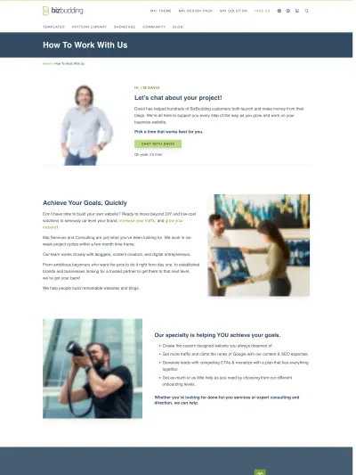
BizBudding
We recently made some tweaks to our services page to improve conversions, and they have made a big difference. The main change was the addition of photos of our company president, David Schmeltzle to the top and middle of the page with a CTA to schedule time to chat. Photos of you and your team help instill trust in your website visitors, especially if you do a lot of consulting work. We also include a contact form, in case anyone would rather connect that way.
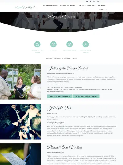
Write Weddings
The icons/link columns (using Mai Icons) at the top of the page serve as a nice way to see what is available immediately as well as navigate to the service you want to learn more about. From there, the simple image/text sections clearly present the options, rates, and how to get started.
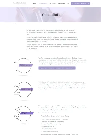
Caplan Health Institute
Caplan Health Institute uses a simple, yet effective approach to display how their consultation process works, with sections for each step of the way, followed by an in calendar integration for new clients to schedule by phone or video chat.
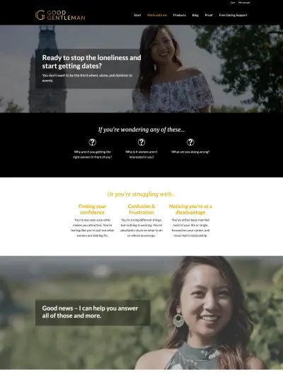
Good Gentleman
Good Gentleman’s work with me page is on point! It starts by posing the different struggles of being a good guy in need of dating help, and then presents the options and how they are a fit based on what they need help with. The page continues on with content that builds a connection, reinforces the viewer is in the right place, and shows Ruby’s expertise and authority. The explanation of how sessions work and the testimonials (both written and video) help to strongly round out the end of the page, and I can’t help but love the closing CTA hook: “Ready to have that special woman wrapped in your arms? Let’s talk.” Nailed it.
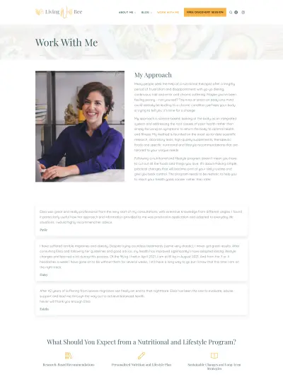
Living Well Bee
I love how Living Well Bee’s services page starts off with her approach. It integrates the struggles and frustrations of her audience, what makes Elisa different from other nutritional therapists, and the outcome her clients can look forward to if they work with her. The fact that this section is followed immediately by testimonials helps to reinforce her message. All in all this is a lovely page design that flows nicely, is visually interesting, and answers all the common questions.
Simple Sections
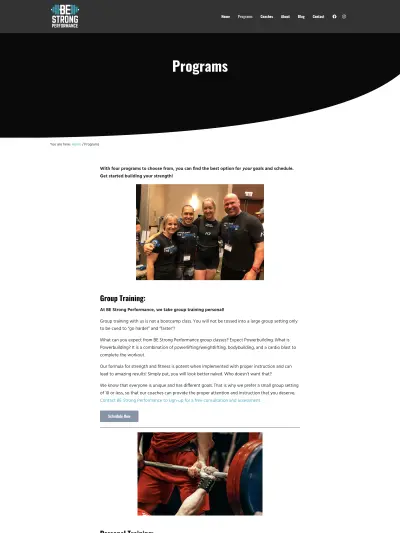
There’s nothing wrong with a no-frills approach to your content! Here are some service page examples that use simple sections with things like lists, images, grids, full-width CTAs, videos, and contact forms. These businesses do a nice job of clearly outlining their services so people know when and how to get started.
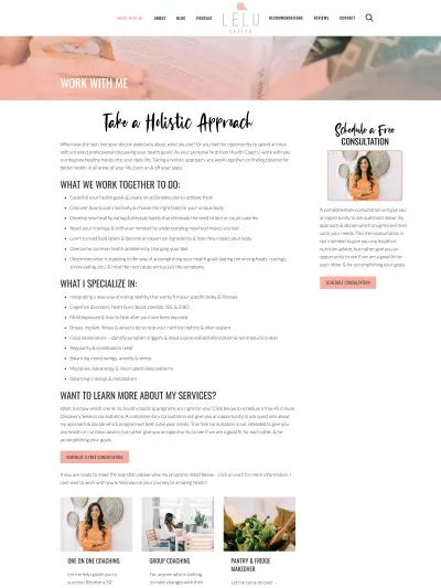
- Lelu Health: https://leluhealth.com/work-with-me/
- Sarah Galbraith Laucks: https://sarahgalbraithlaucks.com/services/
- Be Strong Performance: https://bestrongperformancegym.com/programs/
- BrainCare Performance Center: https://braincareranchomirage.com/conditions-treated/
- Greater Orlando Chiropractic & Wellness: https://gocwchiro.com/services/
- Kitchell Chiropractic: https://kitchellchiropractic.com/services/
- Glover Chiropractic Clinic: https://gloverchiro.com/services/
Grid of Services
These pages use the Mai Post Grid block to list out and link to detailed pages for individual services. As mentioned earlier, this approach that may make sense for websites with many services where search engine optimization for each part of your digital marketing plan.
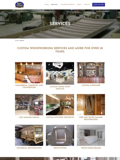
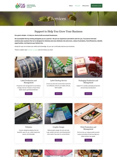
- Beck & Ness: https://beckandness.com/services/
- True Leaf: https://trueleaf.io/services/
- Burk Construction: https://burkconstruction.com/services/
- Mahmoud & Associates: https://mycpapros.com/services/
- All Day Endurance: https://alldayendurance.com/products/
Website Templates with Services Pages
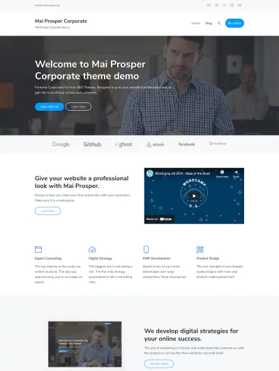
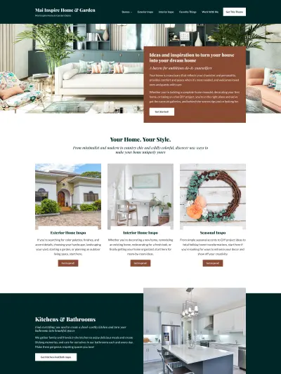
Check out these Mai Theme website templates if you are ready to start building the website of your dreams. Each of these includes a ready to use services page, though you can easily create a services page on any of our templates using the page patterns provides below or by building from scratch yourself with blocks.
Also check out our homepage block patterns for more options.
Service Page Block Patterns
Not to disappoint, our amazing developers/designers, Mike and Sam, have whipped up some gorgeous service page block patterns to help you build your services page in no time!
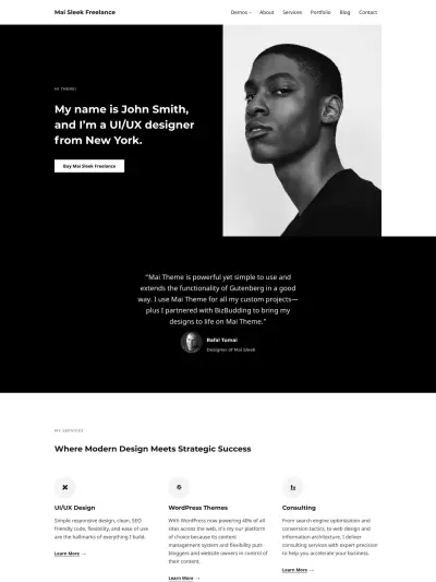
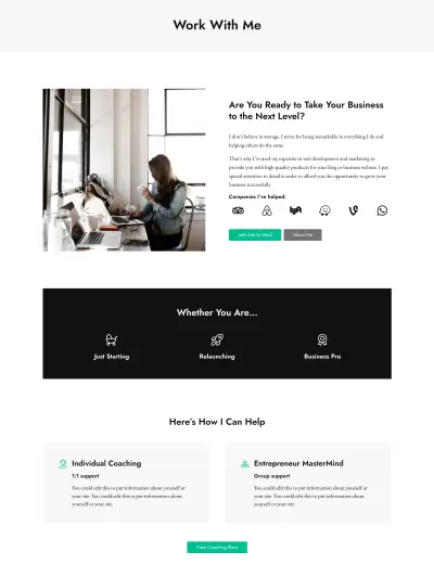
Work With Me Pattern
Are you a badass entrepreneur or side-hustler looking to make a name for yourself and book more clients? This pattern is for you!
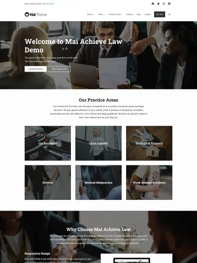
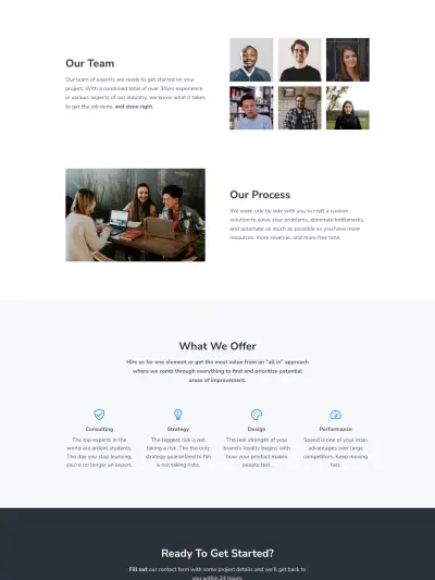
Traditional Services Page Pattern
Are you a small business, agency, or other team in a service-based industry? Show off your professional chops with this sleek services page pattern.
Closing Thoughts
Whatever you decide to put on your services page, don’t forget to address your audiences struggles and desires and how you can help them achieve success. Focus on the outcome, show social proof, and make sure to include the information they need to know to decide if they are good fit for what you have to offer.
Download the How to Start Blogging Guide
Explore this FREE GUIDE to take a deep dive into how to start blogging to make money. Get a PDF version of this guide right to your email, plus weekly tips from our blogging experts at BizBudding.


