
Get personalized content recommendations and answers drawn from our website. Simply type your question or topic of interest, and our AI assistant will help you find relevant articles, tips, and insights. You can also have a natural conversation to explore topics in more depth.
A Note on the WordPress Visual Editor vs. Text Editor
Before we get into our guide on content writing for websites, we want to make an important distinction regarding editing website content in WordPress. There are two ways you can view/edit your content—either through the “Visual” tab or the “Text” tab.
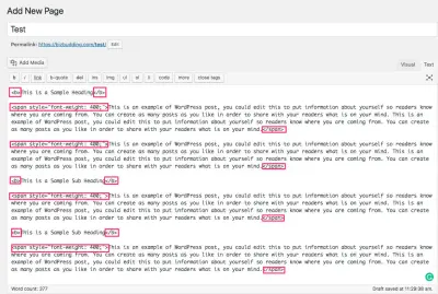
While you may have a preference for the Visual editor because it looks cleaner and is easier to read, make sure to at least review your content in Text mode before you publish. This can help you spot any formatting that does not belong, i.e. if you pasted content from another source (Word, Google Doc, etc).
Here’s an example of some content pasted from a Google Doc. All marked up items would either need to be removed or changed (i.e. is the updated cleaner version of (bold)). If you bold something in the WordPress editor it will have the tag.
If you have to paste in your content from another program, the shortcut for pasting without formatting is command-shift-v on Mac or ctrl-shift-v on Windows.
Note that when you do this, you will also lose formatting you may want to keep, such as bolding and hyperlinks, so you’ll have to cross check against the original and add those things back manually. To avoid this you can write the content directly in the post editor, and if it needs to be reviewed by an additional team member, you can place it in Draft or Pending Review status.
Also worth a mention, the new block editor (also known as Gutenberg) in WordPress 5.0, makes both formatting within the editor and pasting in content from another word processing document much easier.
Content Writing for Websites Checklist
Now that we got that preface out of the way, let’s get started with some guidelines you’ll want to follow to create and maintain SEO-friendly, high-quality content.
This guide is not a content marketing strategy, though many of these principles can (and should) be applied to your overall digital marketing strategy. This guide is intended for web content writers, freelance writers, small businesses, content creators—really anyone tasked with managing or writing content for a website.
1. Proofread
Proof the content for spelling and grammar, and clarity/readability. Try the Grammarly extension if you use Google Chrome. It’s free and makes editing a whole lot faster. Don’t skip reading through the content carefully though. Grammarly misses things like misused words (i.e. their instead of there).
2. Check for Clarity/Readability
Avoid unnecessarily complex language when possible.
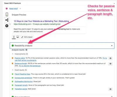
Write in the active voice. I.e. use action verbs to instruct the viewer what they should be doing. This is especially important for CTAs. There is a readability analysis section within the Yoast meta box which can be helpful in checking these elements of your writing.
To make your content more readable you may also want to include bullet points or numbered lists when appropriate. If you do utilize a numbered list and you name your post something like 7 Ways You Should Use Video Marketing (this is also referred to as a “listicle”), it’s a good idea to leave the number out of the slug (more about slugs further down), that way if you revise the post in the future and change your list, the URL still makes sense and there’s no need for a redirect.
Use white space. Breaking up your paragraphs (some people even prefer to write with a space between each line) makes the content easier to digest and will keep visitors on the page longer. Another thing—more of a design preference but still valid—is to use a full-width page template that has white space on the sides of the content (check any of our blog posts for an example of this). It avoids distractions that sidebars can provide and has a very clean, modern look.
3. Use Headings Appropriately
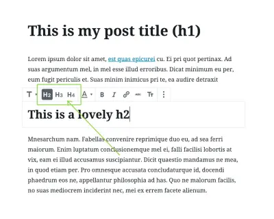
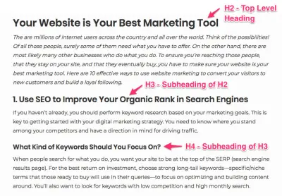
- The content should contain headings where appropriate and properly utilize H2, H3, etc. hierarchy.
- H1 is for your content title only.
- H2 for main topics
- H3 for subtopics of H2, etc.
- Use proper capitalization in your headings. There is some variation based on what style guide you ascribe to, but here are some capitalization guidelines. You can also consult your brand guide if you are unsure.
- Do not format text as both a heading and bolded text.
- Use bolding for emphasis. Sparingly. Because this is annoying and makes it difficult to understand what is actually important.
4. Use Consistent Voice
Are you humorous, confident, straightforward, bold, quirky?
Branding is not all about visuals. You should fully understand what your brand voice sounds like and keep it consistent throughout your website. This helps the right people form a connection with you and makes you memorable.
A lot of factors go into figuring out your brand voice: what image do you want to portray, who is your audience and what do they respond to, what are your values? Take the time and make sure everyone on your team is in agreement and clear on your brand voice. You can create a brand guide to document this information, which is especially helpful for larger organizations. We’ll talk more about branding and how to create a brand guide in our joint course, How to Build a Remarkable Blog, with award-winning public speaker, New York Times bestselling author, and world-renowned health expert, Dr. Sarah Ballantyne, PhD.
5. Incorporate Internal Links
Add internal linking when possible, but don’t overdo it. There is no hard and fast rule for how much you should be linking within your content, but in the past, Google has stated you should keep your links to under 100 to a page, and this is still a good guideline in most cases. Use your judgment—the number of links should be proportionate to the content length.
Internal linking requires a certain familiarity with the rest of the site’s content. A brand guide may highlight cornerstone content and other pertinent links (i.e. start here, about, shop, and product pages). Otherwise, you can put together a list of these key links to make internal linking quicker.
Additionally, if you have certain words that are repeated frequently, i.e. a probiotics company, will use the phrase “probiotic supplements” quite often, do not link that term every time to your shop page. It can come off pushy to the reader, and the more links you use, the more you dilute your PageRank. A well-placed CTA gets the point across better.
Do not link to your homepage unless it’s a unique situation (Personal Brand sites with 2-3 pages only).
Focus more on including a diverse set of links, utilizing longer, specific anchor text, and linking back to cornerstone content. Using this strategy creates a solid internal linking network on your site.
6. Use Relevant Anchor Text
“Click here” is a terrible anchor text because it does not tell the user or search engines anything about what you’re linking to. Your anchor text should be descriptive and relevant. If you are linking to post, try to include the whole post name or at least the main topic when possible.
Example: “Caring for orchids can be very rewarding if you follow a few simple guidelines.” Is better than… “Click here to read more about orchids.”
7. Include External Links & Set Them to Open in a Separate Window
Internal links can (and should) open in the same window, but you want your outbound links to open in a separate window in order to encourage people to stay on your site.
To set the link to open in a separate window, click the gear symbol for link options when adding the link. Check off ‘Open link in a new tab’.
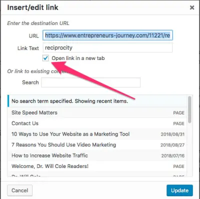
Or add the rel=”noopener” value to the link when viewing in text mode. Here’s an example:rel="noopener">Example Site
External linking might seem counterintuitive because you are sending people away from your site, but it is actually beneficial for several reasons, mainly that it builds credibility and trust, makes you a more valuable resource to your visitors, and can actually encourage backlinks. External links can also be revenue generating links (think affiliate links). That’s a separate topic, but it’s worth noting that since affiliate links are, in essence, ads, you should nofollow them (add the rel="nofollow" attribute).
In sum, external links are not going to kill your rep or hurt your rankings, so use them when it makes sense. If there is a better resource on a particular topic you can share with people to make their lives easier, do it. (Like this post from Moz diving deeper into the 5 Reasons You Should Link Out to Others From Your Website. ?)
8. Carefully Check All Links
Click on each link to make sure they work (and are not redirecting). Redirects can be subtle to catch, but if the link that opens is not exactly the same as what you have entered, then they are redirecting. If they are, update the link within the content.
Misspellings in links or changes to the slug that were never fixed with a redirect will cause them to break (404 error). This is a bad experience for your users and should be fixed as soon as possible.
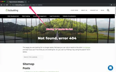
- For redirects: Update the link within the content.
- For broken/404: First, determine why it’s broken (misspelling, removed page, link restructuring), then, either remove the link from the content (usually only done if it’s an external link or removed page that’s already been redirected), enter the link properly, or redirect to fix.
In addition, it’s a good idea to periodically check your entire site for broken links as regular content maintenance (removing thin content, combining content, rebranding, updating/streamlining site architecture, etc.) can cause changes in links. We’ll talk about that later in this post, but some great tools for checking for broken links (also for redirects) are Screaming Frog, Google Search Console, and our personal fave, Sitebulb.
9. SEO it Up
- Run through the search engine optimization settings in Yoast (SEO title, meta description, focus keyword checks, all that good stuff). You’ll find this meta box beneath your content. Go through the Yoast checklist and aim for green lights when possible.
- The focus keyword should relate to the main topic of the post and should be informed by your keyword research and search volume.
- Include focus keyword in target areas: SEO title & meta description for sure, slug & headings when possible.
- The meta description should include action-oriented language (i.e. Read this post to learn more about how space invaders are real and in your backyard right now).
10. Add a Featured Image & Alt Text
Set the featured image. Choose an image that is relevant to the topic and is in line with your brand.
Note: When naming your images, it’s highly advisable to use a file naming convention. This keeps things clean and easy to understand for other users/editors. Use dashes in place of spaces (search engines understand these as spaces).
Add the alt text to the featured image as well as any additional images within your content. The alt text should describe the image so that a visually impaired reader can understand it. If one of your images break, the alt text also clues in the reader as to what should be there.
Alt text should also contain the focus keyword when possible. If the focus keyword doesn’t make sense with your image, either choose a different image or leave the focus keyword out. It will not kill your SEO. Clarity is always better than keyword stuffing.
11. More Stuff on Images
We all know people have short attention spans. Using images throughout your content helps to break things up, increasing engagement and time spent on the page.
Images also increase our understanding and memory retention (known as the Picture Superiority Effect), especially important when more complex concepts are involved.
Check the cropping formats to make sure the image looks the way you want. Some themes (like Mai Theme) have settings to where you can designate the featured image to be used as the banner image. Keep in mind though, banner images are essentially background images, and you need to be aware of their aspect ratio. If you are using a banner image part of it is cut off, this is the reason.
In most cases, your images should not link to anything unless it’s a special circumstance such as linking out to an affiliate product or another outside source you want to credit.
Media & Attachment URLs
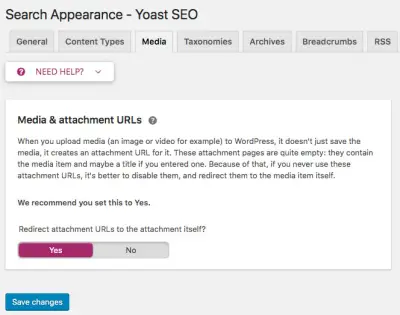
If using Yoast, make sure the “Media & attachment URLs” setting is set to Yes. You need to do this manually, and it is VERY important that you do unless there is a very good reason not to. Leaving it set to No can cause your media attachment pages to be indexed by search engines. All those media pages would then look like thin content, which is a red flag to Google and can negatively impact your rankings.
To find this setting, go SEO>Search Appearance>Media.
12. Assign the Post to a Category
Best practice is to assign the post to 1 category. This makes for better user experience, allowing people to easily find what they are looking for. Categories are exclusive to posts. If a page, assign the parent page if applicable.
*Sidenote: This is a whole separate beast, but it’s important you do not get carried away with categories—an ideal number is between 5-8. A little more is okay, especially if your site is more complex, but they should be clear and distinct. If you are struggling to figure out which single category to place your content in, you may need to rethink how you’re organizing things.
Don’t forget, you can use subcategories and tags when needed. Categories are your main buckets, tags are specific descriptors, and subcategories can further break down your categories. For example, on an ecommerce site that sells clothing, you could have the category “Shirts”, subcategories “Tees”, “Tanks”, and “Hoodies”, and tags blue, black, and red.
13. Respect the Slug
Slugs may be slimy pests, but they still deserve respect. Okay…so we are not talking that kind of slug. The slug is the end of your URL, the part which actually explains what the post/page is about. It can be edited, but you need to be really careful in doing so.
If you are going to edit the slug, do so BEFORE publishing the post. Doing so after will require the need for a 301 redirect, which can be done through the Yoast Redirects tool if you have the Yoast Premium plugin or through the .htaccess file. If you do your redirects through the .htaccess file and are not experienced working with it, let your developer handle these changes because mistakes in there can crash your site. (Or if you’ve set the Yoast Redirects tool to write directly to the .htaccess file, then that can be dangerous too if you’re inexperienced/not careful…I learned this one the hard way.)
It’s usually a good idea to remove unnecessary words (aka stop words) from your slug (again, before publishing), such as articles (a, an, the), pronouns (I, you, we, us, they/them, him/her, etc.), and other short words that do not add clarity or value.
14. Always Include a Call-to-Action
Always is a dangerous word to use in a fight with your significant other, but when it comes to including a call-to-action, ALWAYS works. CTAs are important because they guide the user in what to do next, in turn, increasing conversion rates. Use a CTA to direct your website visitors to more similar content, a product or service, an email or membership signup, a free resource download, etc.
The topic of the post/page content and your current business goals should inform as to what the CTA should be.
- Make sure the CTA is clear in language and intent.
- If it says “Buy Now”, it should go to the cart page.
- Make sure the CTA stands out. Use a button at a minimum.
- Avoid CTAs that fully block the page content (aka interstitials).
- Opt for unobtrusive corner pop-ups that can be easily dismissed with a “No thanks” or similar button.
A note on interstitials: These full-page ads or CTAs interrupt the user experience, forcing users to scroll past or click before they can view the rest of the content. They may have some useful applications, but on typical content-focused websites, it’s recommended to stay away from them as much as possible. If used improperly, they can decrease engagement and retention, and you could even be penalized by Google. They can be a problem on desktop but are more of an issue for mobile viewing.
Dynamic, Globally-Controlled In-Content CTAs
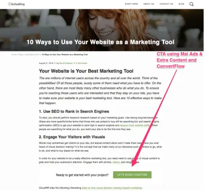
With the Mai Ads & Extra Content plugin, you can display CTAs within the content (i.e. after a certain number of paragraphs like we do in BizBudding posts) or before or after your content by simply adding CTAs to the area you want. No more editing every single post/page! And if you use ConvertFlow, you can make those CTAs dynamic using conditional actions, tagging, and Flows, controlling what CTA site visitors see based on what actions they’ve completed and where they are in your marketing funnel.
15. Remove or Combine Thin Content
This is more of a holistic step for your site as a whole, but very worth a quick overview. Check that the word count is appropriate for the type of content. For example, a page about a service you offer is likely to have much less text content than an article type post. For your posts, you should typically aim for 1200-1800 words, but they can be longer, especially if the top competing posts are. (We talk about these points a bit more at the end of this post.)
If you’ve been producing content for a while, it’s inevitable that eventually you’ll have some pieces that are very similar or closely related, and if combined, could be much stronger. Consult your analytics and based on which post is getting more traffic, you can combine your content into the better performing post, and then do a 301 redirect.
If the page/post has a low word count and no real value, you can delete it using a 410 response code.
16. Show EAT (Expertise, Authority, Trust)
Turn on the WordPress author box settings. Here’s how… >Users>Go to author’s profile>Under Author Archive Settings check Author Box settings. This also can be done globally with some simple code. Contact your WordPress developer if want to do this and are unsure how.
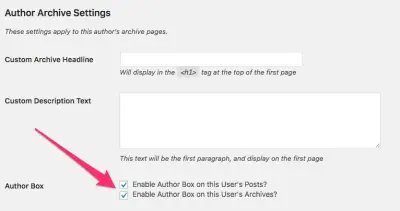
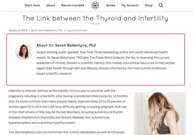
When you enable the author box, a picture of you with your bio displays at the end of each post (by default, but can be at the beginning—with some code—as seen in the example below).
Make sure your bio addresses the important information—who are you and where your expertise comes from. The more fact-based your site is, the more you will need to validate your credentials. The example below from The Paleo Mom does a great job of addressing EAT; it presents essential background information including notable achievements and Sarah’s credentials and describes what she believes and how she enacts those beliefs to help others.
For more science-based websites where you are referencing a lot of facts and outside resources, make sure to properly cite your sources in a reference section. Check out any of The Paleo Mom’s posts to see a great example of a Citations section.
Again if your content is very technical or science-related, it can be very beneficial to show that it has been peer-reviewed. There are plugins with this functionality, such as Mai Post Reviewers, which allows you to show the name and photo of the reviewer and link to an archive page showing posts they’ve reviewed.
Content Creation: A Brief Guide on What to Include
Keyword research is important to understand the search terms your target audience is using and what you are already ranking for in Google search. Based on this information you can create a content schedule for refreshing old content and creating new content.
That being said, getting your content to rank has evolved over the years and over Google’s various algorithm updates, so content writing for websites needs to evolve as well. It is more about including the right words and elements (videos, images, infographics, etc.) in your content, over dropping in your keyword X number of times (or worse keyword stuffing) and calling it a day.
When creating new web content (or refreshing old content) we analyze the top-performing posts for the chosen keyword to determine what key terms need to be included, how competitors are using those terms, and what types of content they are—article, landing page, video, person, product, other.
To elaborate on content types, content for a product page should look very different from an educational blog post. On a product page, the web copy for your product descriptions should be very precise and clear. Videos are very helpful for potential customers in understanding how the product works. High-quality images, showing different angles and labels (if applicable) are also advised. An educational blog post should be long-form content that guides the user through everything they want to know on the topic.
We also look at the recommended word count and reading level (i.e high school, college). You need to write for your audience and for the length and types of language they (and Google) are used to seeing in other like content.
Who is BizBudding & How Can We Help You?
BizBudding is not a marketing agency. That is, we do not focus on marketing exclusively. We incorporate our content writing services into an overarching content management strategy, and that’s just part of what we do.
Our expertise and skill-sets are diverse—our team is comprised of full-stack developers, marketing and content specialists, and web designers that understand how all the pieces of a website come together to create a remarkable experience.
This makes us the perfect partner for you if you are looking to build a new website with fast hosting, refresh your current site, or optimize your content, lead generation, and monetization. (And we recommend those steps in that order.)
We specialize in website and theme development for WordPress, creating great content that ranks, and driving conversions.
Download the How to Start Blogging Guide
Explore this FREE GUIDE to take a deep dive into how to start blogging to make money. Get a PDF version of this guide right to your email, plus weekly tips from our blogging experts at BizBudding.


