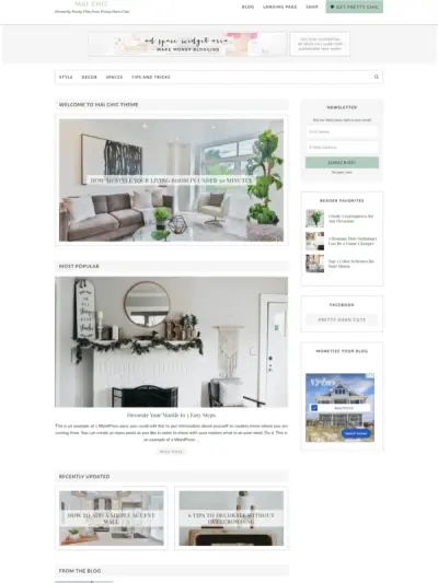
Offer opt-in pages are arguably the most important pages because they drive lead generation and revenue, turning website visitors into subscribers and buyers.
Offer or opt-in page examples include services pages, product pages, sales pages for courses or memberships, webinar landing pages, or any page where you are making an offer.
Whether you’re selling…
- Inspiration and motivation
- Resources and recommendations
- Services or products
- Memberships or courses
- Events or training
You’ll need at least one offer page on your website.
Some offers are free, such as a lead magnet designed to get people on your email list, and some are paid. Both are important to your online business’ conversion optimization and marketing strategy, and you’ll likely have need for both at one time or another on your website.

Get personalized content recommendations and answers drawn from our website. Simply type your question or topic of interest, and our AI assistant will help you find relevant articles, tips, and insights. You can also have a natural conversation to explore topics in more depth.
What Do Visitors Want to Learn from Your Offer Opt-In Page
People visit an offer page to satisfy six curiosities:
- WHO – To see if they’re in the right place, if your offer is for them, and if others have had the success.
- WHAT – To see what solution you have available and if it can or will solve their problem or deliver their desires.
- WHY – To see how your solution / offer / package is different or better than your someone else’s.
- WHERE – To see relevant location information or to check out process details.
- WHEN – To see if it’s the right time to take action or if they are in the right stage of business or right mindset.
- HOW – To see they’re a fit for your offer and how you work (evaluate process and price).
Only when they feel satisfied that your offer is the best choice will they apply, inquire, book, buy, sign up, or subscribe.
WordPress Themes for SEO: How Templates Impact Ranking in Search Engines
WordPress Themes have a profound impact on your SEO, but many website publishers trust that all WordPress Theme vendors have made their themes SEO-friendly. Search Engine Optimization (SEO) is affected by so many factors, from content quality to SEO keyword research, to backlinks to readability, it is difficult to know what changes have had the …
What to Include on Your Opt-in Page
A high converting landing page—whether it’s for a free opt-in or paid offer—should do the following:
- Present a problem or desire.
- Explain why addressing this is crucial.
- Paint a picture of what’s possible.
- Share your solution and its benefits.
- Share the results that can be expected.
- Share testimonials that support your claims.
- Invite people to take action.
Each of the above can be sections of your offer page.
We recommend creating your opt-in page BEFORE your about page or even your homepage. This helps you get clear about what you’re offering or selling and who you’re selling to.
For a very simple opt-in—such as an general email sign up—usually a simple squeeze page will suffice. A squeeze page is typically comprised of a heading, a few lines of copy about the offer, and a signup form. You can still pack a punch on a basic squeeze page and incorporate the above elements with some honed in copywriting.
In addition to the copy that speaks to the above points, here are some other basic elements you’ll want to include:
- Social proof – Use Mai Testimonials or a plugin that pulls in social media reviews (or possibly both!)
- Bullet points to describe the benefits and what you get
- An offer – This may be a free ebook, email series, download, webinar, consultation, or it may be a paid offer.
- A signup form to capture emails – Include other form fields based on your needs, but be aware that the more fields you include, the more likely your visitors may bail without completing.
- A call to action where people will opt-in, sign up, subscribe, download, schedule a call, request a demo or more info, or click to purchase. Include a compelling headline, descriptive copy, and a CTA button in a standout color.
How to Build an Opt-in or Offer Page in Mai Theme
You have three options for building your opt-in page in Mai Theme (WordPress theme).
- Use one our landing page templates from the Mai Pattern Library.
- Use pre-built block patterns from the Mai Pattern Library or from elsewhere on your Mai Theme website to create the layout and content sections.
- Build your web page entirely from scratch, creating the layout and sections manually by utilizing Gutenberg and Mai Theme blocks.
We are going to focus on the first two, since #3 is a bit more advanced and involves you having a really clearing understanding of the content you need, how you want to display it, and how to use blocks.
Option 1: Use a Landing Page Template from the Mai Pattern Library
Mai Theme Pro and Lifetime Bundle subscribers have access to the Mai Pattern Library, a collection of pre-built patterns that provide the ability to add complex section layouts to pages and posts without adding each block one by one.
Best of all, these patterns are designed to work seamlessly with Mai Theme. All you do is find the pattern you like that fits your needs, copy it with one click, and paste it into your opt-in page.
The pattern will automatically adopt the colors, fonts, and other styling of your website.
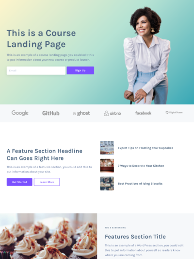
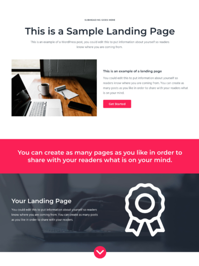
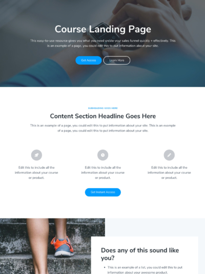
From there, you can replace the images, copy, and other content with your own. It’s a super quick and easy way to build landing pages—without code or page builders!
Check out these landing page patterns to get started.
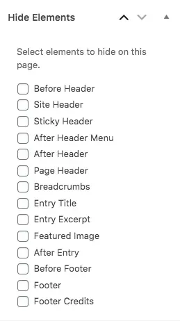
If you want to hide certain elements on your page to make it feel like a true landing page, navigate to the “Hide Elements” meta box in the page/post editor sidebar and check the items you wish to hide. For more help, check out this tutorial on how to build a landing page with Mai Theme 2.0.
Option 2: Use Pre-Built Block Patterns to Create the Layout and Sections
Another option piece your page together from different block patterns in the Mai Pattern Library or from other places on your Mai Theme website. This option is typically for users who are a bit more advanced, and have a good understanding of blocks and page design principles.
For example, if you really love the testimonials section on your homepage, you can select all the blocks that make it up, copy it, and paste it into your opt-in page. Or, check out these testimonials patterns.
You can even copy your entire homepage layout (or any other page) the same way. (And yes, there are patterns for every Mai theme homepage in the Mai Pattern Library.) These would make great landing pages with a little tweaking.
As previously mentioned, in Mai Theme, you can turn any page into a landing page by simply hiding the elements you do not wish to show—such as the menu, site header, footer, and footer credits, etc.
Bonus: What to Do After Your Opt-in Page is Built
Once your have finished your opt-in page, there are a couple more things you’ll want to do to tie it into your sales funnel and increase your conversion rates. While I will not be getting in depth on these topics, it makes sense to quickly touch on them.
Create a Thank You Page
Thank you pages are often an overlooked opportunity. Redirect people to a thank you page after they have opted in to your offer to increase engagement and follow-through.
This page may include more information about where to get the freebie, a link or button to download the freebie, steps on what to do next, or a contact form ask questions or get more info.
Drive Traffic to Your Opt-In Page
Ideally your page will be optimized for SEO, and that should bring in some organic traffic, but you should still drive traffic to it through other means, such as email marketing and social media.
Here are a few tips to put your opt-in/offer in front of more people:
- Use exit intent or other unobtrusive pop-ups on your website that link to your opt-in page. Remember to check how they appear on mobile devices for responsiveness.
- Consider creating a short email series to promote your opt-in (especially if it’s paid), or, simply share it with email subscribers in your regular newsletter
- Use the Mai Custom Content Areas plugin (Mai CCAs) to place CTAs for your opt-in in relevant locations on your website, such as within related blog posts after a certain number of elements. You can experiment with direct sign up CTAs and those that drive traffic to the landing page to see which get better results.
- Focus your content marketing on a weekly or monthly theme to support your offer. For example if you are offering a free webinar on making maple syrup at home, create and promote content on your blog, in your emails, and on social media that month that talks about equipment you need, how to identify ideal maple trees for tapping, and common beginner questions.
Closing Thoughts
Create your offer opt-in page before your about page and homepage so you can have a clear understanding what you are selling/offering, who it’s for, and what problem it solves. This gives you valuable context for your other pages and ensures you give priority to potentially one of the most important pages on your website.
Here are some key action items from this post:
- Start by writing down answers to these six questions in relation to your offer:
- Who is your offer for and who has had success by choosing your offer?
- What is your offer, what problem does it solve, and what benefits or outcome does it provide?
- Why is your offer different, better, or unique from the competition and the best solution for your audience?
- Where is your offer happening or what are the process details?
- When is the right time, the right stage of business, or the right mindset to take action. (If the offer is for a limited time, emphasize the urgency and benefit of acting now.)
- How is this offer and how you work a fit for your audience?
- Next, write down some content to express each of the following:
- Present a problem or desire.
- Explain why addressing this is crucial.
- Paint a picture of what’s possible.
- Share your solution and its benefits.
- Share the results that can be expected.
- Share testimonials that support your claims.
- Invite people to take action.
- Make sure you have these basic elements for your offer page:
- Social proof in the form of testimonials, social reviews, and/or ratings
- Bullet points to describe the benefits and what people get
- A free list building off or a paid revenue-generating offer
- A opt-in form to capture emails (when applicable)
- A call to action with a compelling headline, descriptive copy, and an action button in a standout color
- Choose a method for building your offer page:
- Use one our landing page templates from the Mai Pattern Library.
- Use pre-built block patterns from the Mai Pattern Library or from elsewhere on your Mai Theme website
- Build your web page entirely from scratch, creating the layout and sections manually
- Build your opt-in page, relying on the landing page patterns and block patterns in the Mai Pattern library to take the guess work out of your page design. Then update the sections with the content you wrote down, your own image, and your CTA.
Download the How to Start Blogging Guide
Explore this FREE GUIDE to take a deep dive into how to start blogging to make money. Get a PDF version of this guide right to your email, plus weekly tips from our blogging experts at BizBudding.


