The about page is one of the most visited web pages on a website. People who are considering working with you want to get to know you, figure out if they like you, and decide if they trust you.
- They want to know who is behind the brand and who they will be working with.
- They want to satisfy their curiosity and see if they’re a fit.
- They want to make sure you are who you say you are and can do what you say you can do.

Get personalized content recommendations and answers drawn from our website. Simply type your question or topic of interest, and our AI assistant will help you find relevant articles, tips, and insights. You can also have a natural conversation to explore topics in more depth.
What is Your About Page About?
All of this might lead you to believe that your about page is in fact all about you—and creating a page all about how great you are can be intimidating.
The truth is that your about page copy isn’t actually about you. Well it is…but it also isn’t. It’s about your target audience:
- The results clients experience and why you’re the best person to help them achieve those results
- Why you do what you do and the impact your work can have on their businesses and lives
What Should an About Page Look Like?
There’s no one right way to create an about page. Some about pages will include a professional bio, some will share a story in narrative form, others will consist of fun facts and photos.
Here’s what to focus on when creating your about page:
- Use your full name, not just your first name and not only a moniker like “The Travel Queen.”
- Be welcoming, friendly, and conversational. People buy from real people, so be your real, authentic self.
- Tell people about what you do, who you serve, and how you can help them—and what makes you qualified to do so.
- Share a success story or two or three.
- Have fun! Show your personality and help people get to know you on a deeper level and find things in common with you.
- Help people see you’re just like them—you’ve gone through what they’re going through—you’re just a little farther down the path and happy to help them find the way too.
About Me vs. About Us Pages
If you are the face of your brand vs. a company brand, then your about page is likely going to look a little different.
Both types share a focus on the brand story and brand values, but an About Me page will focus more on your personal story and how that ties into your content and the help that you provide. Your about page may be more casual and fun, but of course that is up to you.
An About Us page will focus more on your company values, company’s history and milestones, founder or co-founders, and team members.
You’ll most likely have to work harder to build trust as a company vs. an individual. As such, company brands may make a greater use of case studies and other trust reinforcers like certifications, badges, and brands worked with, whereas a individual brand may incorporate more fun elements like photos of family and other passions, gifs, and where to find/follow you on social media.
Of course, none of this is black and white. As already mentioned, there’s no one right way to create an about page.
Some individual brands want to give off a very professional vibe on their about page to appeal to potential clients, so they may withhold getting too personal and place more focus on their bio and credentials. The same rings true for some company brands, especially small businesses. They may let you in one some fun facts about their team to help humanize the brand and come off more relatable and easy to work with.
The key takeaway here is to authentically represent yourself, your business, and your core values. When you do this and address your audience’s desires, problems, and goals in your copywriting, the right people will naturally gravitate to you.
Website Planning Step 2: Copywriting for Your Target Audience
In order to write compelling copy for your website that resonates, you need to understand who you are speaking to. In this post, we focus on how to identify your target audience based on their characteristics, problems, desires, and goals.
About Page Bio or Story
One thing most website visitors expect to see on your about page is your professional bio or story. This helps people understand who you are, where your experience comes from, and if they can relate to you.
There are a lot of guides on how to write a professional bio—here’s one, here’s another, and here’s one more—so I am not going to get into the specifics of that here.
However, writing a bio for your about page is different from a professional bio you would use for a job application. You don’t want it to be a laundry list of your professional experience, accreditations, and credentials. While these things are important, you want to work them into your page in a more fluid way.
Your bio can also include fun facts about you to help people relate to you. You can choose to use a story format if this feels more natural. For some websites—especially blogs—they make a lot more sense. There’s a reason stories have been around since the beginning of man—they captivate people and are memorable.
If you have a team, then you can choose to give each team member a section for their own bio. For businesses where team members are crucial to client relationships, such as agency and consulting businesses, this is important to help put clients at ease. They can put a face to name, set expectations, and gauge if you team would be a good fit for them to work with.
Your Value Proposition
A value proposition is a promise of the value you provide to you audience.
It should state the benefits your audience or customers should expect to experience from working with or purchasing from you. It should also address the problem/s you solve for them.
It’s important to include your value proposition somewhere on your about page to set expectations, build trust, and help validate your authority. In addition, be sure to state why you’re the best person to help your audience achieve their desired outcome. This is your unique selling point.
About Page Call to Action
Another thing your about page should definitely have is a call to action. What that call to action is can vary widely depending on your brand or business, but here are some ideas:
- work with me or scheduling form
- free trial or estimate
- lead magnet opt-in
- recommended blog, tutorial, or other resource
Usually you want to start with something free or very low cost/risk. This helps get potential customers on an email list or get in touch with you so you can guide them to the next step in the buyer journey or even close the sale.
For more ideas and block patterns, check out our blog post, 20 Block Patterns That Are Perfect for a Website About Page.
Design Principles
These design principles for your about page are pretty much universal to all web design.
Use White Space
White space helps to break up sections of content so it’s easy to tell where transitions are. It also gives the page an overall cleaner look and flow. Loads of text packed together doesn’t exactly scream read me…but instead makes people scream and run the other way.
Use group blocks with padding and spacer blocks to help create visual separation.
Don’t Go Overboard With Your Page Header
Another common mistake is to try to pack too much into the page header or use an image that doesn’t work well.
If you are going to use a page header on your about page, it’s best to choose a solid background color or an image without too much going on. Patterns or textural type images work well, or, choose something where the focal point will not be obscured or cut off.
The Complete Guide to Website Header Design
Learn everything you need to know about how to design the perfect header that is clear, visually appealing, and user friendly (with videos, examples, and tutorials for Mai Theme 2.0).
About Page Examples
While there is no one page design for an about page, I know it can still be helpful to take a look at what others have done as a reference point, so I pulled together a few of my favorite client about page examples to inspire you (plus our own ? ).
Teams
BizBudding
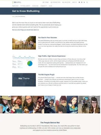
We start off with a few important things to know about us as web developers and what makes us unique. The fun pet photos of our team and section about BizBudding’s history help deeper our visitors understanding of who we are. A large contact form in the middle of the page makes it easy for people to get in touch, and finally we give more info into our company’s history, where we are going, and what we offer.
Four Rivers Clinic
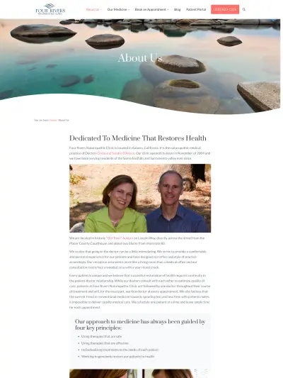
The Four Rivers Clinic about page is welcoming with the serene page header image and photo of the practice’s founding doctor’s. The copy also does a great job at giving necessary location specifics as well as putting the reader at ease with phrases like “We strive to provide a comfortable and personal experience for our patients” and “Our reception area seems more like a living room than a medical office”. The “key principles” and testimonials also build on the trust already established.
Consultants
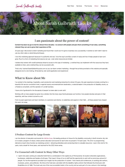
Sarah Galbraith Laucks
As a business and content marketing consultant, it’s important to come off as both relatable and expertly knowledgable. Sarah does a great job of this on her about page. Her breadth of experience is evident quickly, though she presents it in a way that is engaging and interesting. I especially love the personal and fun touch that all the event photos add. Sarah seems like someone you want have in your corner.
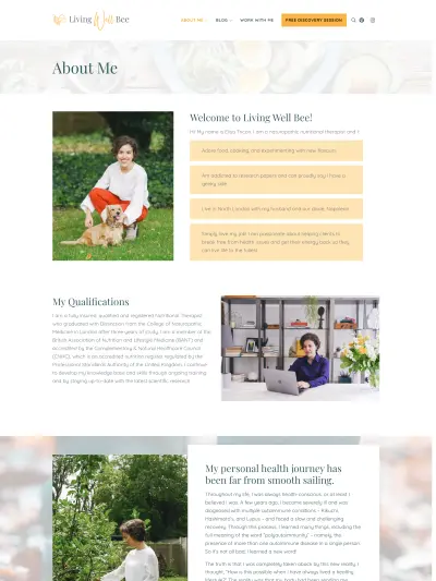
Living Well Bee
The visual interest in the Living Well bee page design is what first grabbed me. The use of color, photos, and background images, make this page a refreshing experience. Not only that, she manages to touch on some fun facts, her qualifications, her story (both the difficulties and transformation), and her philosophy (i.e. core values). The whole thing feels well-rounded and flows beautifully.
Bloggers
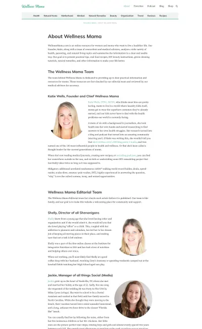
Wellness Mama
The no frills design of the Wellness Mama about page helps to reinforce that the blog is a trusted resource, backed by a dedicated team and a strict adherence to accuracy, outlined within the sections on the Medical Review & Advisory Board and Editorial Guidelines. Facts aside, there is still a bit of fun and quirkiness mixed into Katie and each team member’s bios and stories. The takeaway from the page is that Wellness Mama is a brand moms can trust when it comes to their family’s wellness.
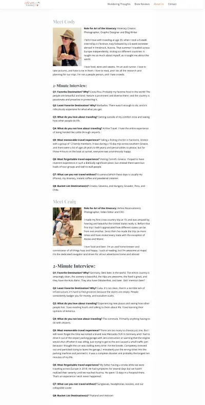
Art of the Itinerary
What I love about the Art of the Itinerary about page are the 2-minute interview sections. This is a really unique yet simple way to present facts about the bloggers and their kids in a fun and interesting way. You get to see how each family member is different in their particular interests and passions, but their love for travel unites them.
About Page Examples with Videos
Here are a couple examples that showcase videos at the top of the page to hook the viewer immediately. Both of these do a fantastic job of establishing a connection with the audience in different ways. Let’s take a quick look.
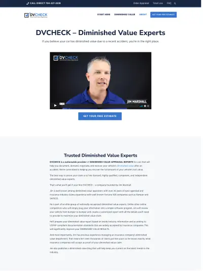
DVCheck
The video that starts off DVCheck’s about page is quick, clear, and informative, but it doesn’t feel stuffy or boring, all of which is especially important when you are addressing a topic that few people understand like diminished value. Then, right under the video is the call to action so you can’t miss it—”Get Your Free Estimate” in a bold button.
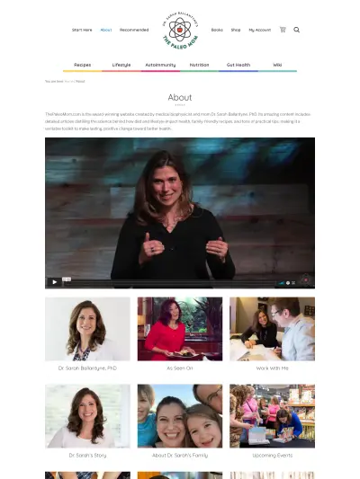
The Paleo Mom
Showing social proof can be very valuable on an about page. Dr. Ballantyne (aka The Paleo Mom) makes great use of testimonials in video form. The video quality and editing is top-notch, combining testimonials with flashes of Dr. Sarah interacting with people or speaking at events. You get a real sense of who she is and what she stands for. The page also outlines her vision, values, and mission statement in the next section to further reinforce how seriously she takes her role as an influencer in the health and wellness space.
This example has the video at the bottom of the page.
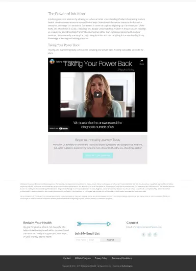
Reclaimers of Health
The Reclaimers of Health about page starts with a message of positivity, hope, and support, which is critical to Dr. Kimberly’s practice. This section is also accompanied by a photo of her and Anthony William, who her work has been shaped by significantly, thus providing an immediate boost of trust to her audience. The video at the bottom shares Kimberly’s story and how her health struggles and transformation have inspired her work. Following that up with a CTA closes out the page strong.
About Page Template
Building on Mai Theme and the block editor makes it easy to create beautiful and engaging pages quickly, without code.
To help you get started with your about page, we created a new About Page block pattern just for you.
With sections for an intro/story, team member bios, values, testimonials, CTA, and more, this about page template gives you a great baseline design to work from.
Closing Thoughts
Whatever you decide to put on your about page, don’t forget, it’s really about your audience and how you can help them solve their problems, overcome their obstacles, and achieve their desired outcome. Your job is to make a connection. Show them that you are like them and change is possible!
Download the How to Start Blogging Guide
Explore this FREE GUIDE to take a deep dive into how to start blogging to make money. Get a PDF version of this guide right to your email, plus weekly tips from our blogging experts at BizBudding.


