You’ve probably heard the saying “less is more.” That phrase can be true of a lot of things, including website design. Minimalism is a popular style for interior design because it’s sleek, modern, clean, and pairs down to what is most important. It’s also a web design trend because those qualities also apply to graphic design. This style is called minimal website design, and it’s one of those things people either love or hate. Taking feelings out of it for a second, we want to take this opportunity to explain what a minimal site design is, highlights the benefits, and describes how to create one on your own site.

Get personalized content recommendations and answers drawn from our website. Simply type your question or topic of interest, and our AI assistant will help you find relevant articles, tips, and insights. You can also have a natural conversation to explore topics in more depth.
What Is Minimal Web Design?
Having a minimalist website allows your content to be front and center with no distractions for visitors. Minimal designs have lots of white space (or negative space) so it makes content, especially striking images and typography, really pop. This is not to say your website must have a white background, though that usually is best for easy contrast and readability.
In minimalist design, every element should have a function, so non-functional, purely decorative elements are typically excluded, focusing attention on the core details. This is crucial as you want your site to be a purposeful and beautiful representation of your brand where the content is always the star.
The best websites are the ones free of clutter, and the most visited sites have easy usability for all visitors. Minimalism in web design offers you the best of both worlds. The best-known website examples of minimal sites are search engines. Google is one of the most visited sites in the world, and it has one of the most minimal page designs.
UI Design
That being said, if you are not a designer by profession, at first glance you might see design as only about outward appearances, but equally important is having a simple, clear user interface. This is called user interface design or UI design (not to be confused with UX design, but it certainly impacts user experience). When it comes to minimal web design and UI, the “less is more” philosophy is paramount. Minimalist interfaces usually look sophisticated and uncluttered providing aesthetic satisfaction.
In the realm of UI design, creating a strong visual hierarchy is also essential. Visual hierarchy is a principle that shows the importance of a page’s content through various visual elements including size, color, contrast, alignment, repetition, proximity, whitespace, and texture and style. Good UI design reduces users’ uncertainty, demonstrates a high level of empathy towards them, and presents visually appealing elements for their viewing pleasure.
Flat Design
A popular example of UI design in minimal websites is flat design. Flat design utilizes simple 2D elements and bright colors to draw the eye. These elements load faster than more complex 3D elements—curves, highlights, shadows, gradients, textures—which is a huge plus for you and your users. Speed is very much correlated to ranking, conversions, and other positive metrics which we’ll get into more below. Flat design also allows for creating images, buttons, icons, and illustrations that look crisp and consistent in different resolutions and sizes.
Simple shapes and minimal textures mean that responsive designs work well and load fast (especially important since mobile devices have slower internet speeds). By reducing the amount of visual noise (in the form of textures and shadows), flat design provides users with a streamlined, optimal user experience.
Interaction Design Foundation
Speed
Google’s core web vitals became a significant ranking factor in May 2021. These core web vitals contain three specific web page experience metrics that Google considers to be of vital importance:
- Largest contentful paint (measures loading performance)
- First input delay (How long it takes for a web page to become interactive. Google wants no more than 100 ms.)
- Cumulative layout shift (stability of content displayed)
But how does it relate to minimal web design, and why is it important to you?
Fast WordPress themes deliver higher search engine rankings. That’s why we focused on speed and performance when building Mai Theme 2.0.
Mai Theme uses powerful yet flexible CSS and JS utilizes fewer assets and smaller files to provide extreme performance with the utmost flexibility. Easily score in the high 90s with Google Page Speed Insights out of the box without any caching or optimization plugins.
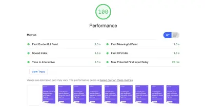
Using WordPress and a solid framework (Mai Theme runs on Genesis, a well-respected theme framework in the developer world) is also important as it means the theme will have a strong foundation and room to grow without sacrificing speed.
Functionality
Minimal web design makes for better overall website functionality. As already mentioned, it creates faster load times and better compatibility between screen sizes. You can still have lots of features on your site, but they will be mostly in the code (CSS), and in WordPress plugins instead of on the page. So you don’t have to sacrifice any important elements, especially those common to ecommerce websites, to have a great minimalist design.
Another benefit of minimal design: customers will stay on your site longer.
According to a study from EyeQuant, clean design results in a lower bounce rate. Minimal design elements make for a user-friendly experience because of easy accessibility. Fewer elements leave no room for confusion. Visitors can find everything they need right away because there’s no clutter in the design.
Keeping things simple gives the user more opportunity to make a better choice because they aren’t clouded by options/choices. They are forced to dive deeper into a specific area of the site.
-Mike Hemberger, BizBudding Lead Developer
To elaborate on Mike’s point, we encounter a lot of people who want “all the things” when starting a new website or blog. It’s okay to have some cool design touches just because, but it’s important to really consider why you want a slider on your homepage or every single one of your pages in drop-down menus.
Is it because you see others doing it? It is purely decorative?
Users actually don’t care much about all the bells and whistles. They are on your website to learn or find something. If there is so much going on that they feel overwhelmed or cannot what they are looking for, they are going to head elsewhere.
Colors & Typography
You might think minimalism is boring, but don’t worry, your site will still look amazing. Minimalist web design doesn’t mean you can only use black & white or monochrome. You can still use bold colors, just keep your color palette to a minimum. Use no more than three colors, especially on your homepage and landing pages. Be sure to keep a consistent color scheme across all of your webpages as well.
As you probably know, color can form an emotional association with the viewer. Some colors are strongly associated with action or buying behavior. Because a minimal design has much fewer visual elements competing with one another, color has the opportunity to have an even greater impact.
This is true for your typography as well. You can get away with a bolder font for your headings—make sure it’s still easily readable though. Themes like Mai Theme with an array of Google fonts to choose from make it possible to easily find something to suit your brand.
Typography can be really impactful on author sites like James Clears’ where the words on the page are of the highest value.
Minimalist sites are modern with understated sophistication. Elegant, bold typography and thoughtful use of color make your business look even more professional and up-to-date. Minimal designs look classy without looking pretentious, and people—both producers and consumers—want to be associated with class.
Create a Minimal Website
As web design agency, we know the critical role that a solid website theme plays in great design. While SquareSpace and other website builders offer minimalist designs, what they do not offer is flexibility and room for expansion as these platforms often do not support the advanced features that many bloggers and small business owners come to need as they grow.
Minimal WordPress Themes
We also know that users love minimal blog design because it makes it easy for them to find what they need and neutralizes the overwhelm many of us feel in our daily lives. We understand that good design never distracts from your content but enhances it.
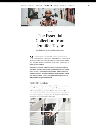
That’s why we partnered with Brian Gardner, a minimalist designer, to create a minimal WordPress themes using Mai Theme. The theme is called Mai Lookbook and is part of our collection of minimal WordPress themes. It offers a clean and clear design, leaves plenty of room for customization, and is unique in its own way.
Additionally, we have a couple other templates that fit the minimalist aesthetic. Here’s a quick description of each:
- Mai Lookbook: Geared toward fashion or magazine sites, this template’s sophisticated, minimal design is ready for the virtual runway. Showcase your clothing line with the high-end, editorial look you deserve.
- Mai Pure: The minimal layout and simple yet elevated design make it the perfect template for creators, authors, and photographers who want to build a portfolio website as well as a name for themselves.
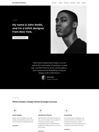
- Mai Sleek: This template’s minimal layout, large blocks of content, and simple yet elevated design make it the perfect template for freelancers, designers, startups, and businesses who want to take their website to the next level.
All Mai Themes Are Minimally-Minded
While the above templates falls under the typical minimalist style, all of our theme designs are minimal in that they emphasize user experience, usability, performance, and speed, and we hope one of them will inspire you to get started building your own website.
Our goal is to make it easy for you to showcase your work, products/services, and brand with a modern, fast, and responsive minimal WordPress theme or total website solution. By relying on clean code and efficient design, we have taken away everything that is not needed, leaving you with designs you can trust to out-perform the competition.
With Mai Theme, the setup is minimal as well!
We know that the installation of themes can sometimes be a nightmare. Not to mention the challenges of getting your new website to look like the demo. Most theme developers do not offer a solution to this problem, but we do! Our Mai Theme Setup Wizard makes it easy for you to get your website looking like the demo in seconds—yes literally seconds.
Quickly and easily transform your website with premium Mai Theme products! Check out our pricing and options.
Download the How to Start Blogging Guide
Explore this FREE GUIDE to take a deep dive into how to start blogging to make money. Get a PDF version of this guide right to your email, plus weekly tips from our blogging experts at BizBudding.


